- Crypto
- Mobile app design
- Fintech
- UX/UI
- Development
About project
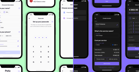
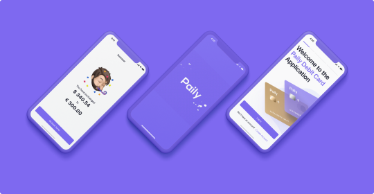
Paily crypto is here to help people store and process any operations with their cryptocurrency. Paily allows you to instantly jump between other Paily products within the ecosystem without a need to verify your account twice.
Task
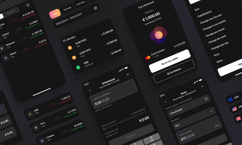
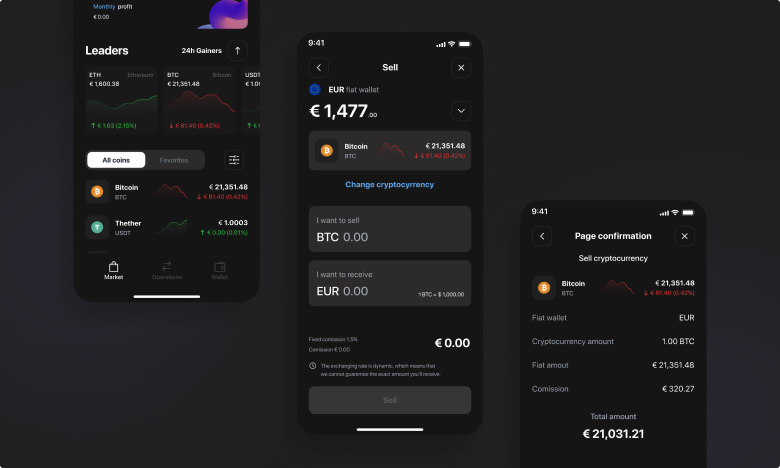
The main idea was to create a safe cryptocurrency environment, where you can exchange fiat and crypto, trade at real-time rates, buy and sell cryptocurrency anonymously.
Roadmap
To create this feature-rich mobile app, the roadmap was divided into 8 main stages:
- 1. Competitor analysis
- 2. Functional requirements, user flow, scenario.
- 3. Lo-fi screens and prototype.
- 4. User testing and analysis.
- 5. New functional requirements, user flow, scenario according to analysis.
- 6. Design concept, UI-Kit, Hi-fi design, prototyping.
- 7. Final user testing and analysis.
- 8. Editing, adjustment and assignment for development.
To achieve the task, our UX/UI design team paid a lot of attention to user interviews (they took more than a month).
Research and analysis
In the first phase of competitor research, the UX/UI designers analyzed more than 10 major competitors, including Crypto.com, Kraken, Crypterium, Binance, 1inch and others. The main focus was on the usability and marketing components of these mobile applications. After the analysis, our designers had a clear idea of what mistakes shouldn’t be made and what ideas they had to implement in Paily Crypto.
Prototyping and user testing
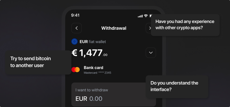
Before user testing, we created a Lo-fi prototype of the future application. It allowed us to identify the problems the user encountered, so that we wouldn't make those mistakes in our final design.
This stage took more than one month in total. During this time, our designers conducted a several dozen custdevs. After analyzing the data we got a clear idea what our user wants to see Daily Crypto. Also following Kano's model as the basic, desirable and admirable elements of the application were highlighted.
UI Design and final testing
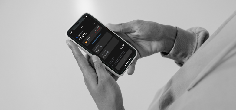
Based on all of our analyses, we started to design our application. During CustDev we found out that our audience prefers a dark theme, so the entire app was implemented in dark colors.
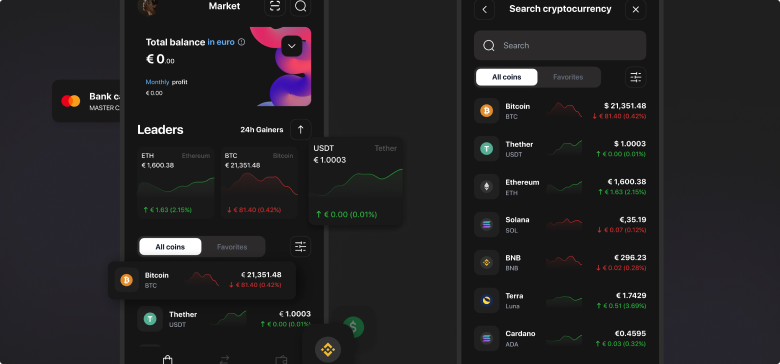
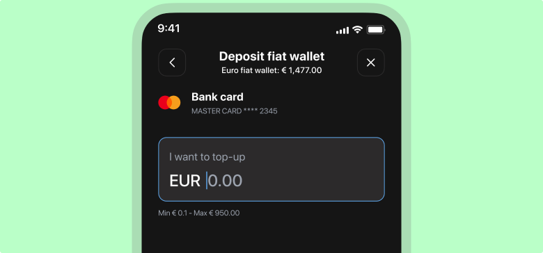
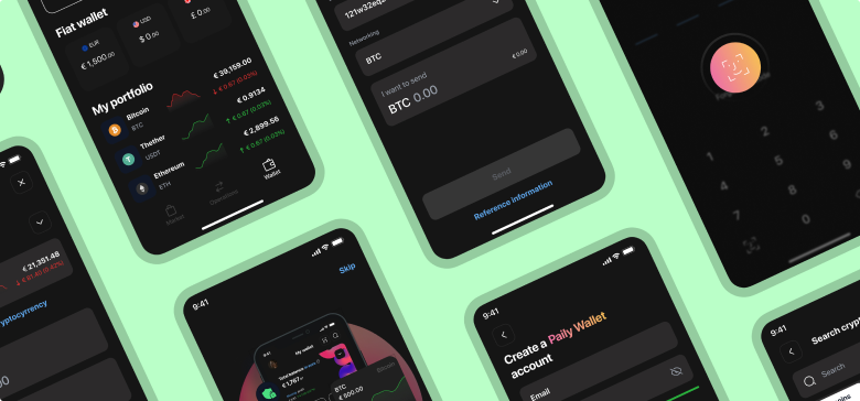
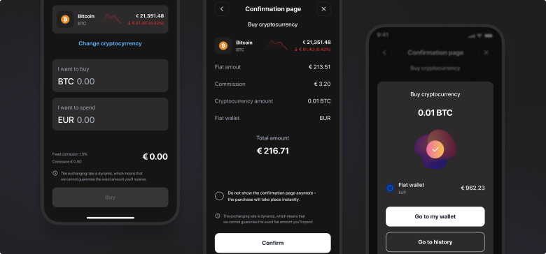
We created over 200 screens and more than 150 UI components during the design process. After the second phase of testing, we made about 80 edits to the final design of our app

-
200+
screens
-
160
days of work
-
5
designers


